The User-Defined (UD) Dashboard is a business dashboard that individual users control and customize. Every user controls the data they wish to see as well as the dashboard's structure and layout. In short, a single user-defined dashboard can display different data to every user.
• If we want to add new charts and graphs then click on "Customize Dashboard" button.
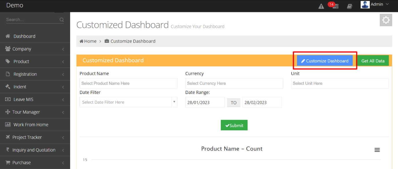
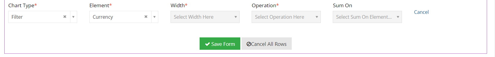
• After Clicking on customize the dashboard, we can see the "Add Row" button through which we can add new charts, graphs, filters, etc. After clicking on that, a new row will be added below and we can fill the fields accordingly.
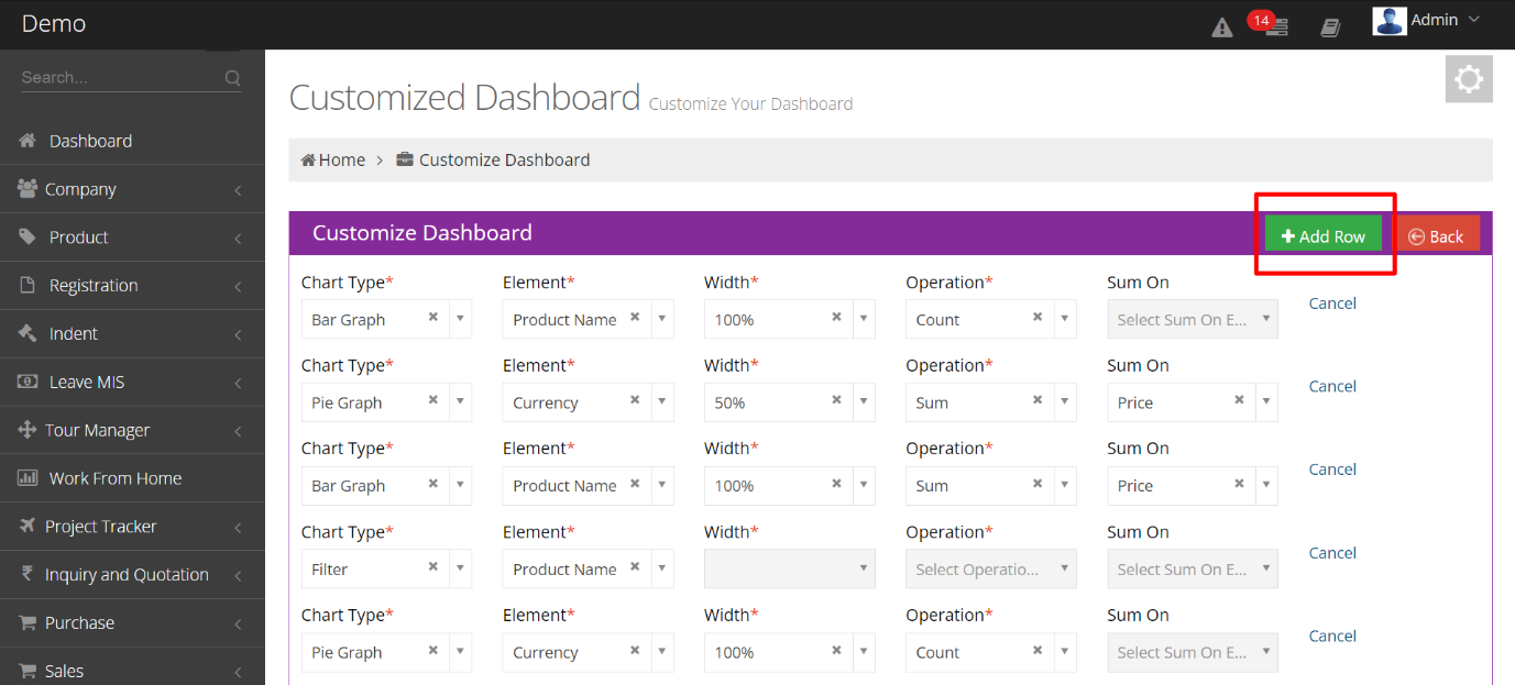
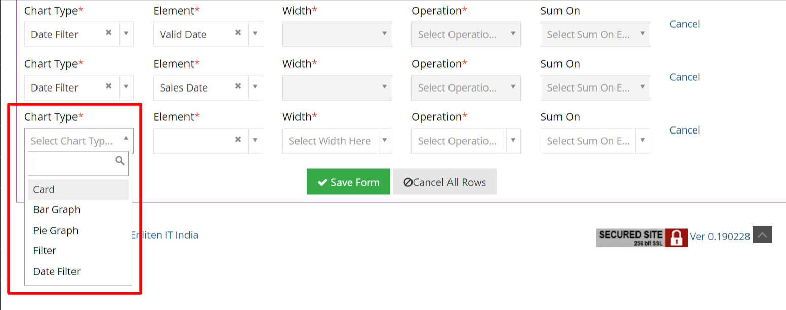
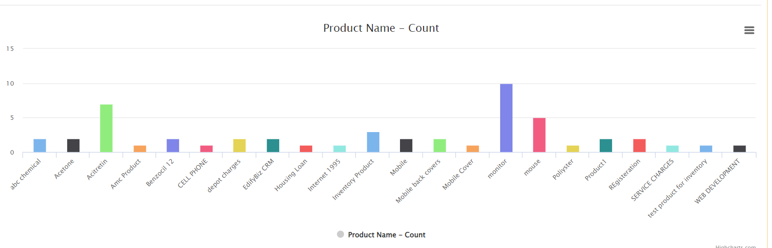
• Here, we can select the dropdown for "Chart Type". For Example, the Bar graph will show the records history of products in the bar graph diagram.
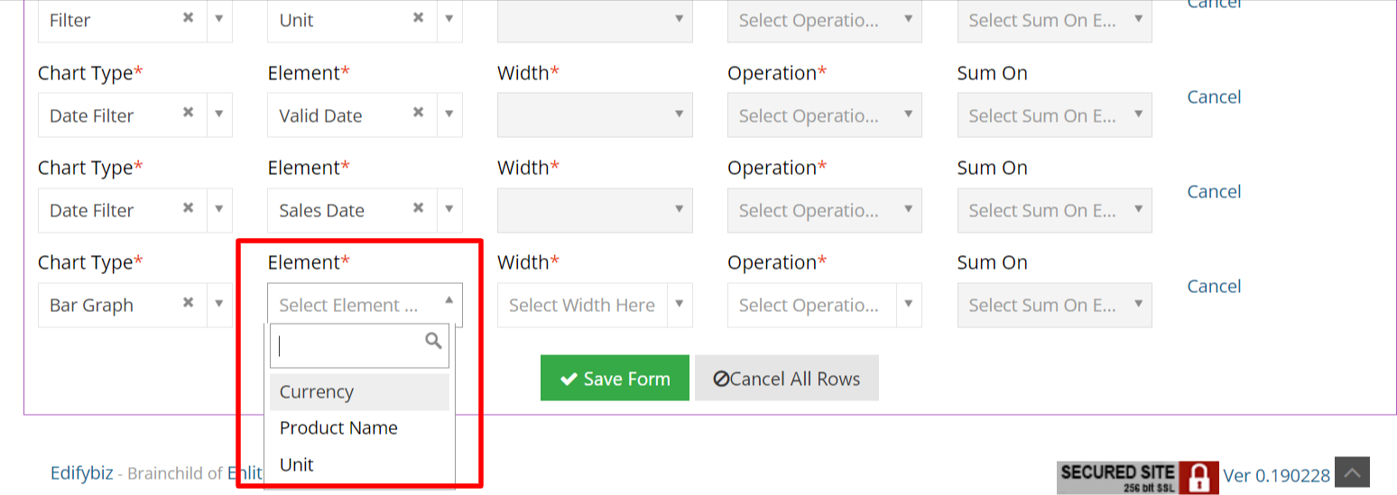
• After selecting chart type we have an Element dropdown through which we can select elements for which we have to show records.
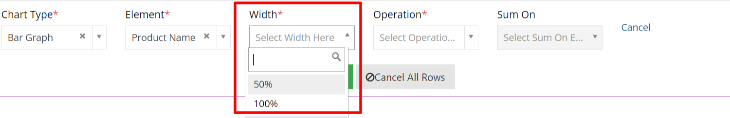
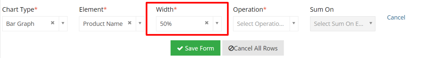
• Here we can select the "Width" of Chart type.
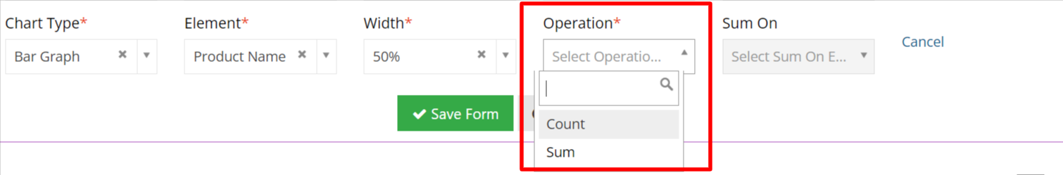
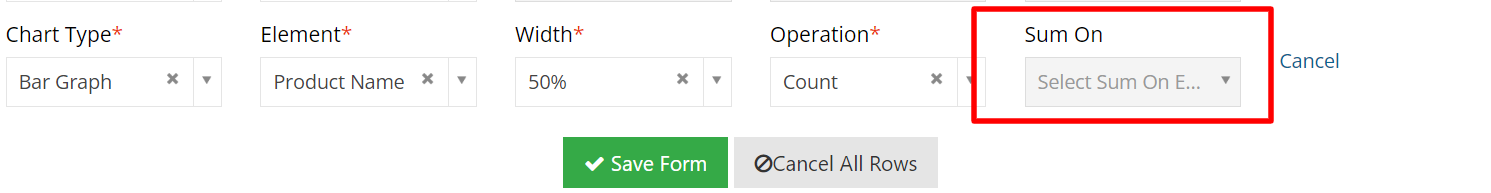
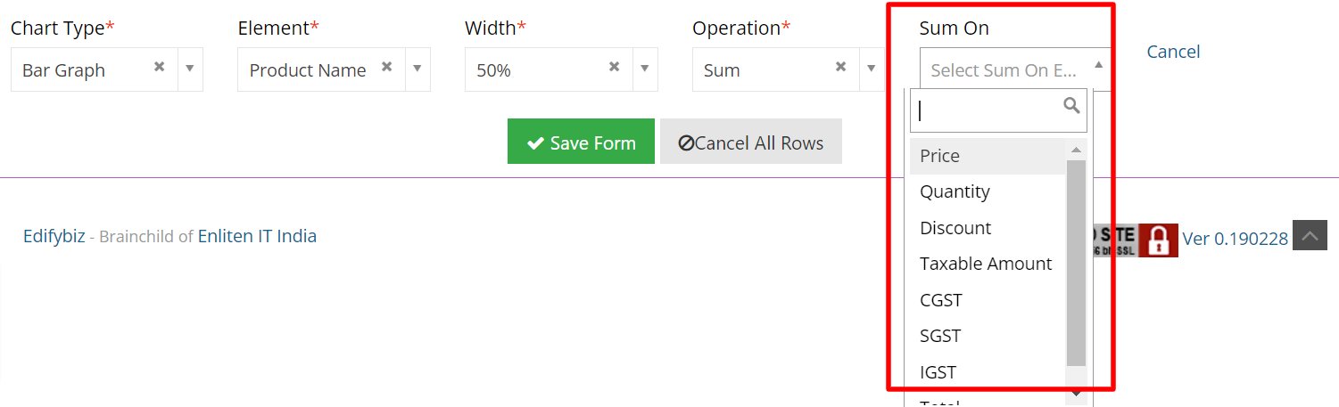
• Here we can choose "Operation" (count or sum) for a selected bar graph.
• If we select count operation, "Sum on option is disabled".
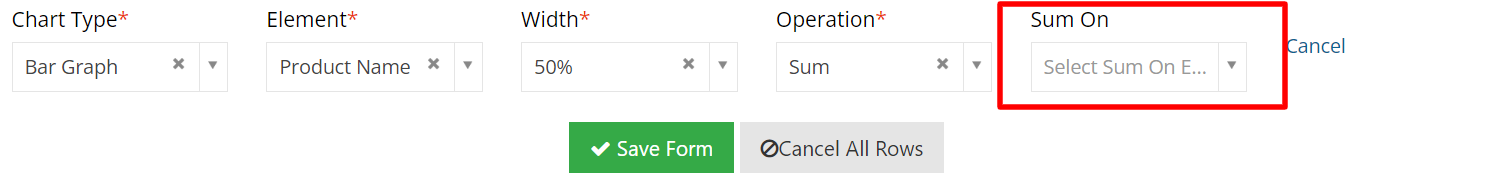
• If we select sum operation, "Sum on option is enabled".
• After selecting "Sum On", we can see an option for the summation of products based on price, Quantity, Discount, GST, etc.
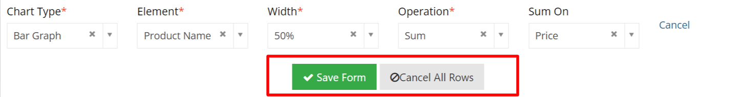
• After adding all the fields, click on the "Save" button.
• On Save form we can see Dashboard with chart type = bar graph, elements = product name, and operation = count.
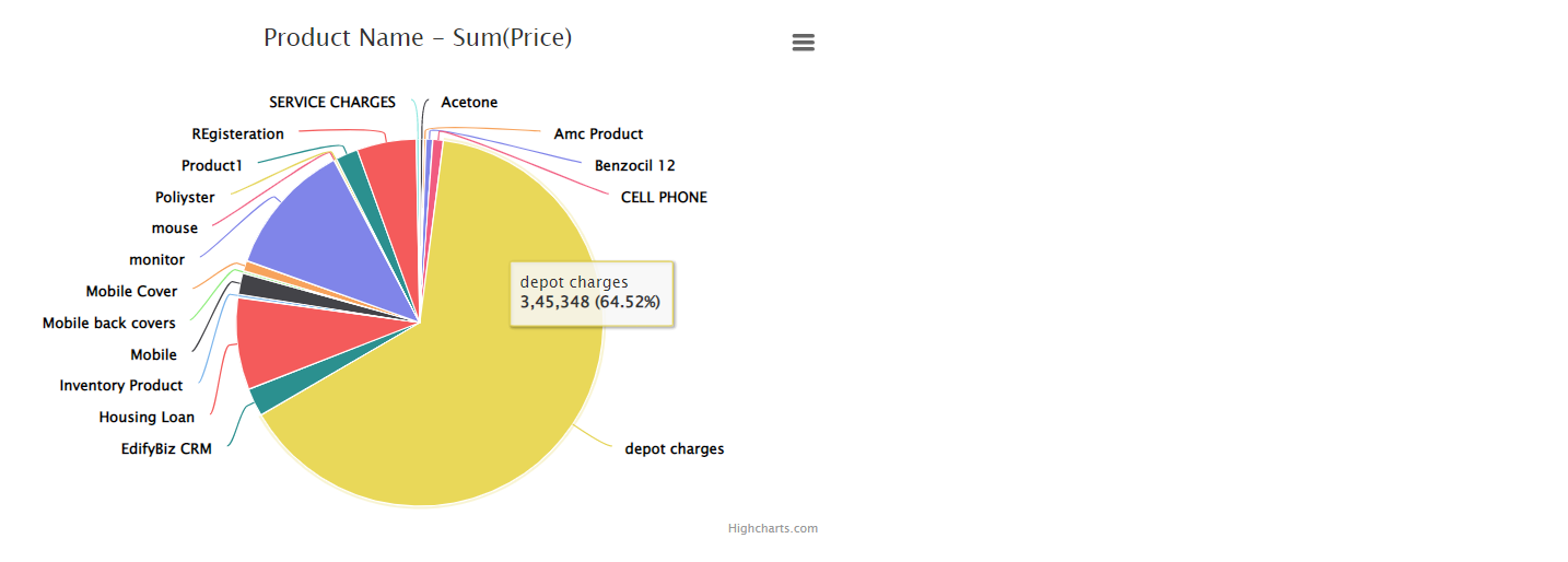
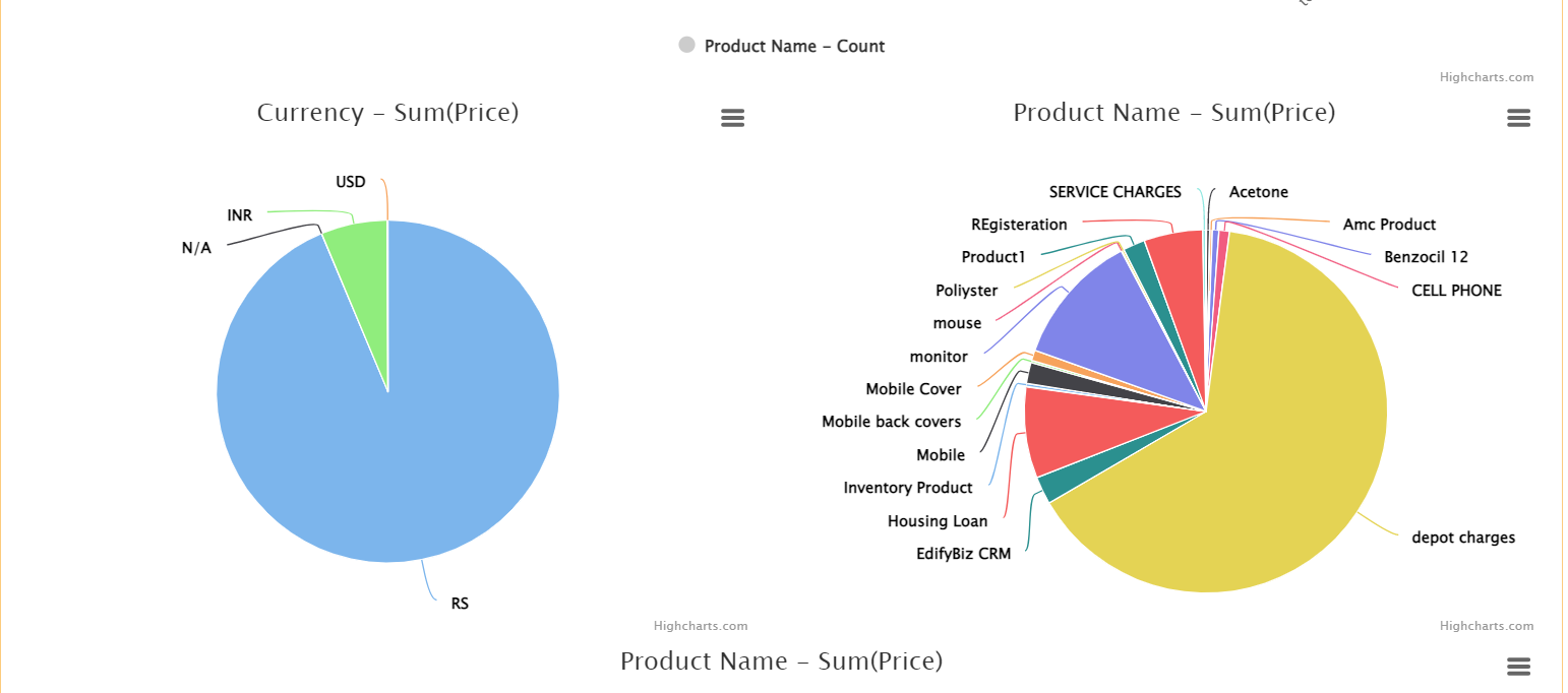
• Also, we can see chart type = pie chart, elements = product name, and operation = count.
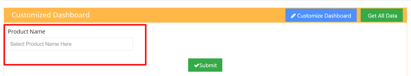
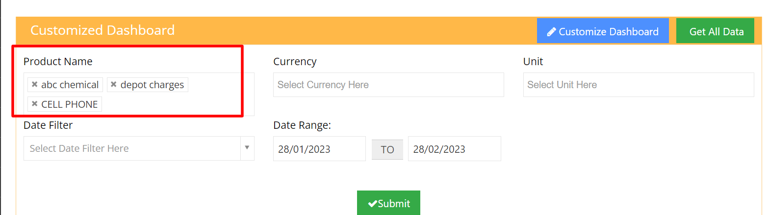
• When we select the filter option from the chart type dropdown and product name from the element dropdown.

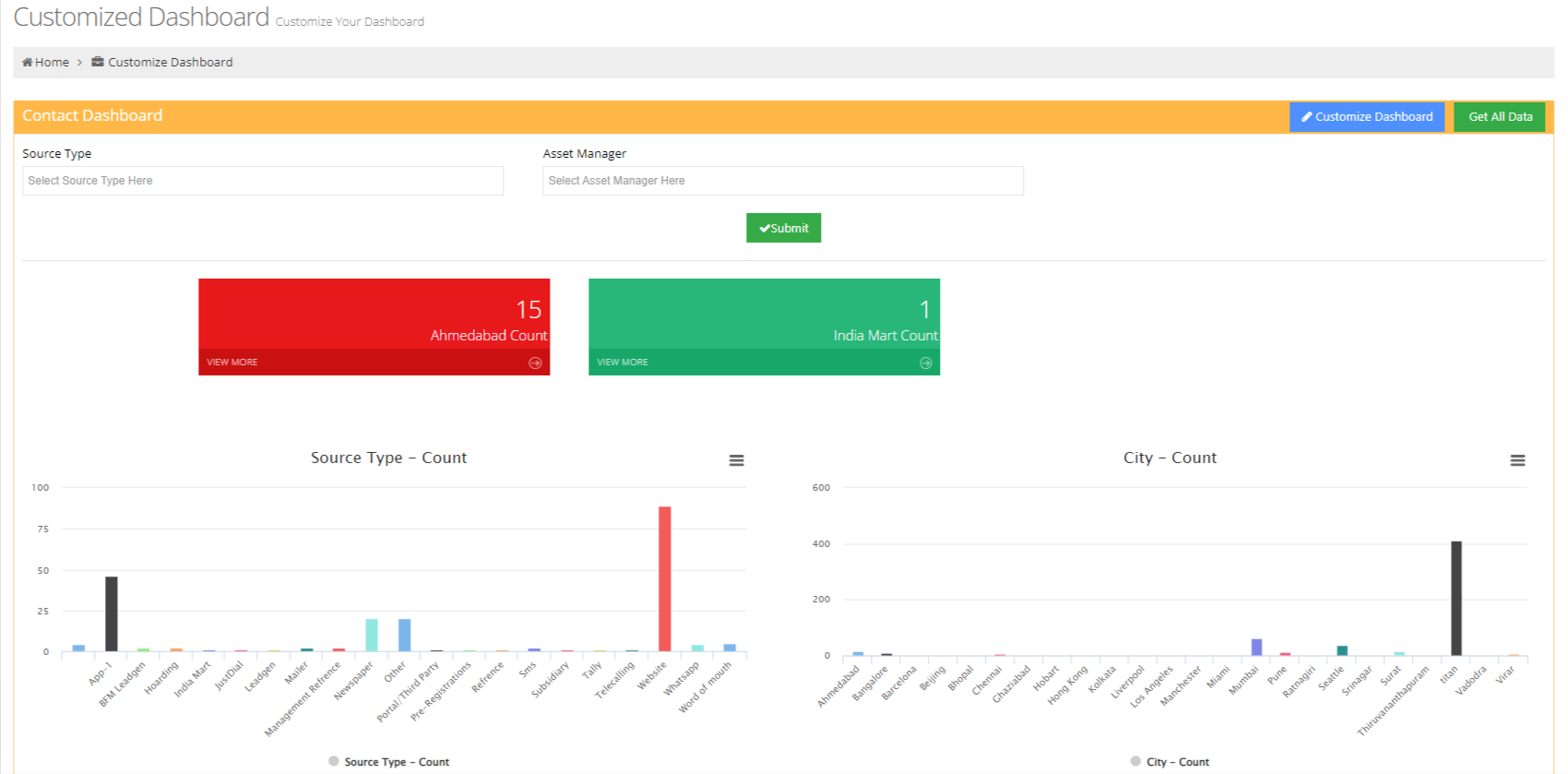
• Then the product name field will get added in this below filter form which we can see at the top of the dashboard and we can filter our graphs and pie chart based on the product name.
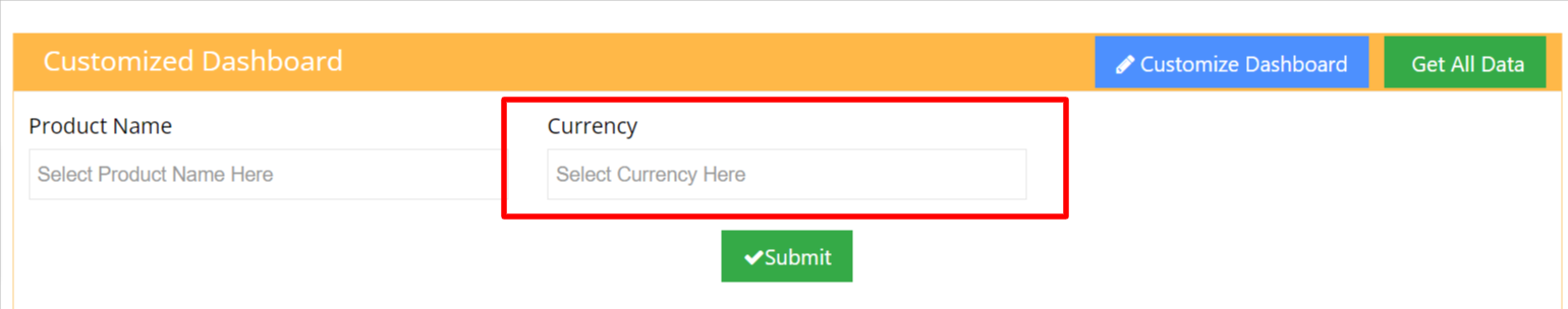
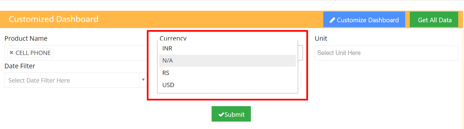
• When we select the filter option from the chart type dropdown and currency from the element dropdown.
• Then the "Currency" field will get added in this below filter form which we can see at the top of dashboard and we can filter our graphs and pie chart based on currency.
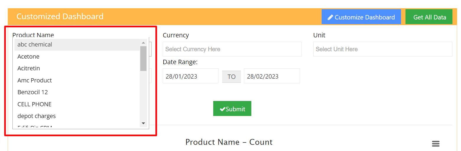
• We can select multiple product names at the same time from the existing product which we want to show in the graph and pie chart.
• Here we can see below, we have selected multiple products at the same time and according to these selected products graphs and pie chart will be displayed.
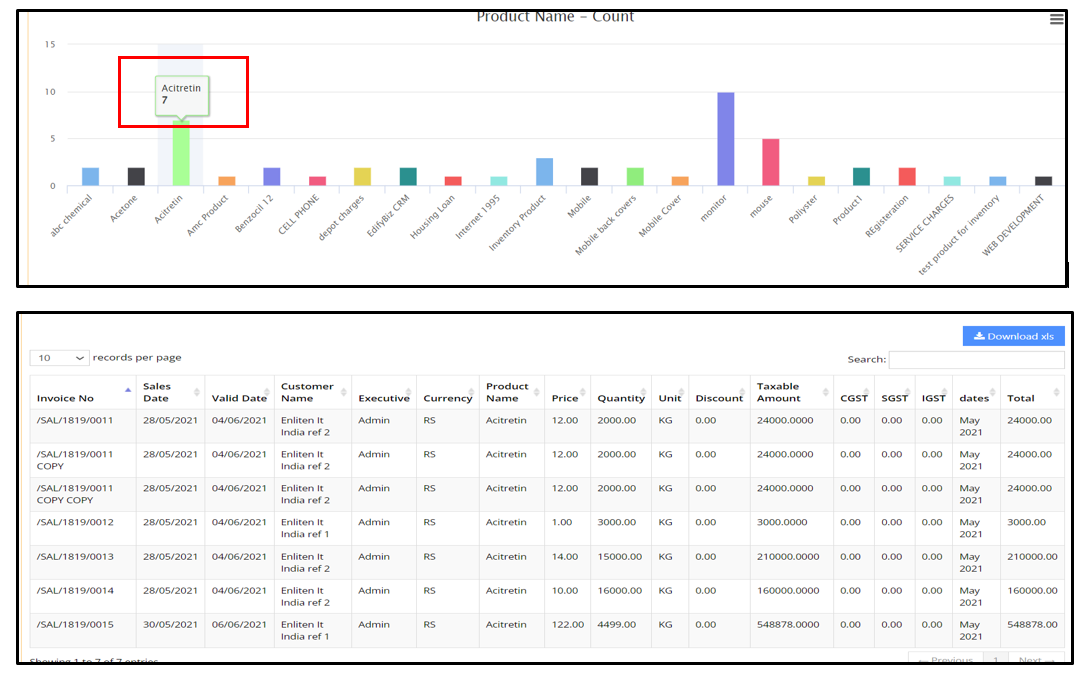
• Here, we can see the output of selected product name graphs after applying the filter.
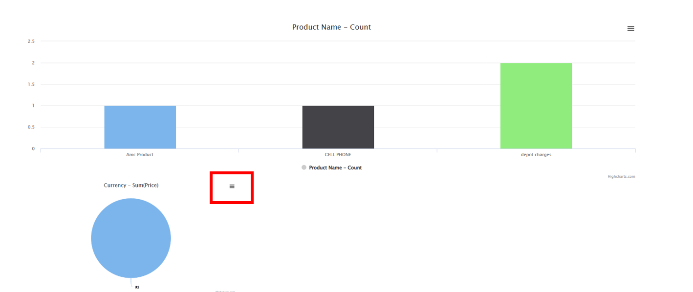
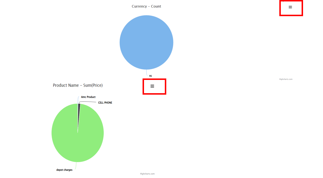
• Those three lines in red colour boxes give the option to print and download the charts.
• Here also we can select multiple currency from the currency dropdown.
• We can select multiple unit from Unit Dropdown.
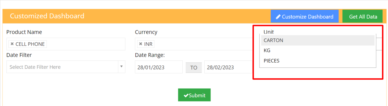
• Here Date filter will give the option to select the date range from a given period of time.
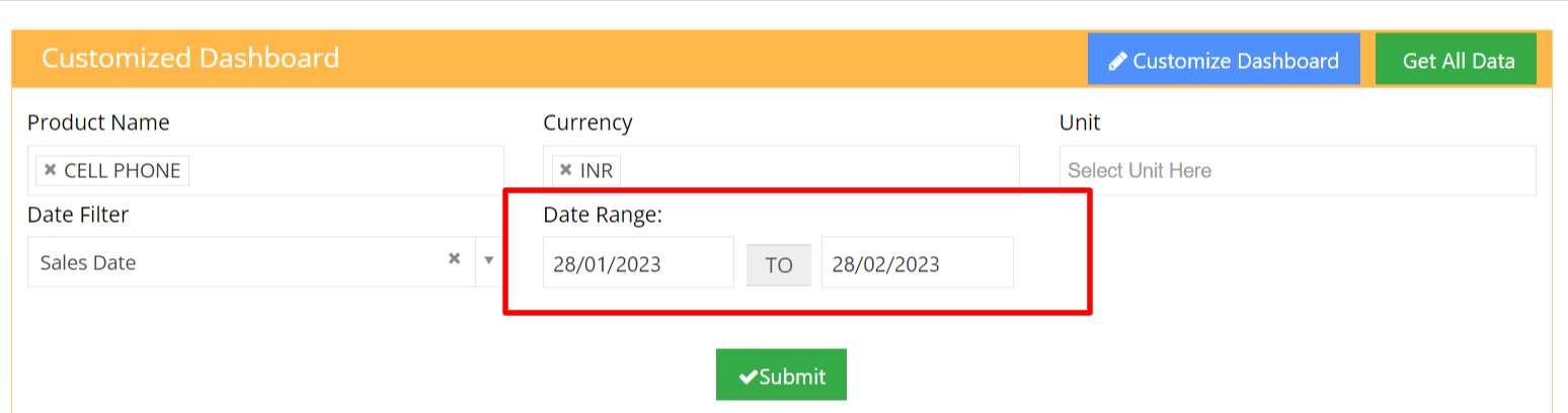
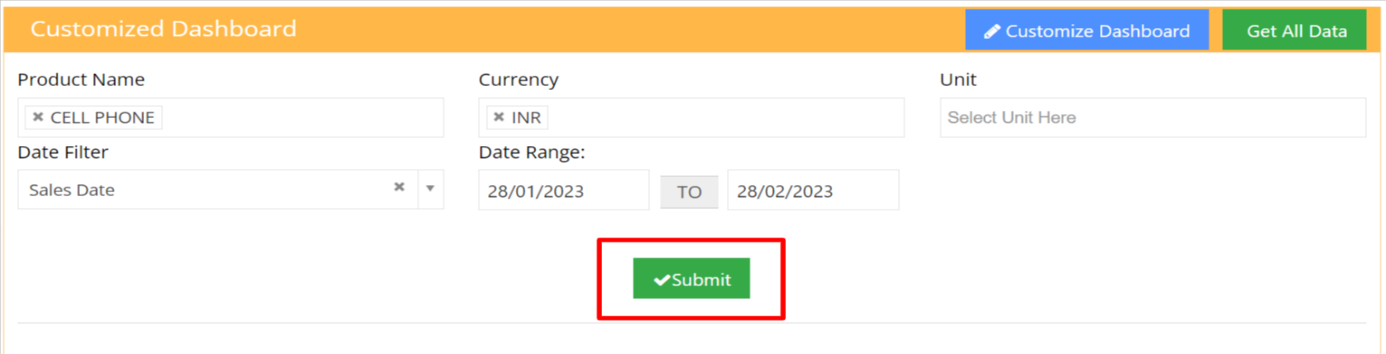
• After adding filters click on submit to reflect on charts.
• If we click on Acitretin, we will able to see the brief description of the product in the table.
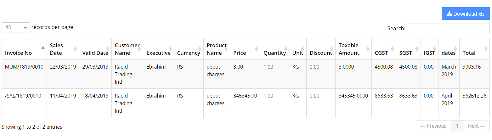
• If we click on depot charges, we will able to see the brief description of the product in the table.